Examples of coronavirus emergency appeals and what we can learn from them
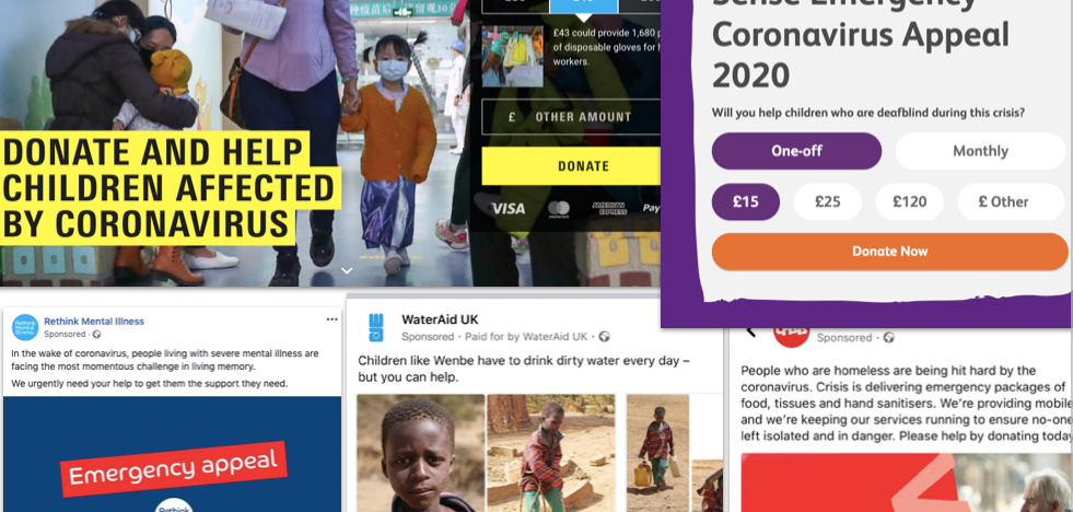
It’s hard for everyone to navigate the current situation. It’s even harder for fundraisers who are launching their coronavirus emergency appeals to help their organisations. There are currently many questions to answer and we are part of a situation that there’s no benchmarking to compare your results.
That’s why we’ve thought of looking at several different coronavirus emergency appeals to provide some ideas on how to create a successful appeal on your own.
Whether you’ve already launched your emergency appeal or not, it’s good to find inspiration from others and improve your next steps!
Pay attention to your tone of voice
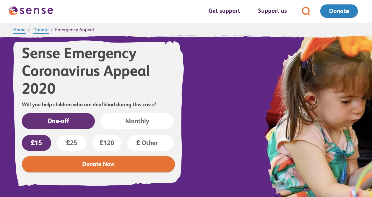
This is the emergency appeal from Sense aiming to support children and adults with complex disabilities. Their tone of voice on their social media posts is warm and helps their audience feel more connected to them.
Looking at their journey, their landing page is very clear. If you are ready to donate then you will find the process very quick. If you need to find more details, you keep scrolling to read more about their vital work.
Explain how each donation helps
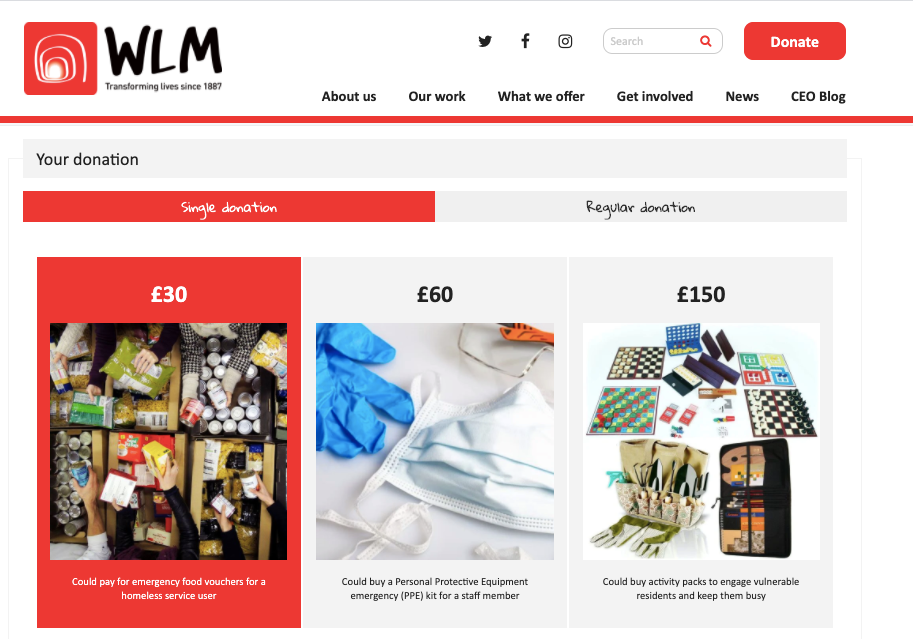
West London Mission are all about empowering people affected by homelessness, poverty, and trauma. Their landing page for their emergency appeal is a great example of how to be visual when explaining how each donation is helping towards the bigger goal.
This is making it easier for people to feel more connected to the cause when making a contribution.
Create a video for your appeal
There are many different ways to promote your appeal. A video can make it easier for your supporters to learn more about your appeal on various channels. Penny Appeal have partnered with Age UK Bradford to launch their coronavirus emergency appeal to protect the elderly. Their video is simple but effective and it also provides all the information you need to find out more about their appeal.
Add information to your visual content
Age UK Bristol have created visual content that makes their tweet stand out but also provide important information. Images can make your tweets more engaging but you also want to make sure that you share the details that matter. That’s why this example reminds us of the importance of keeping a balance between copy and visuals.
Highlight your team
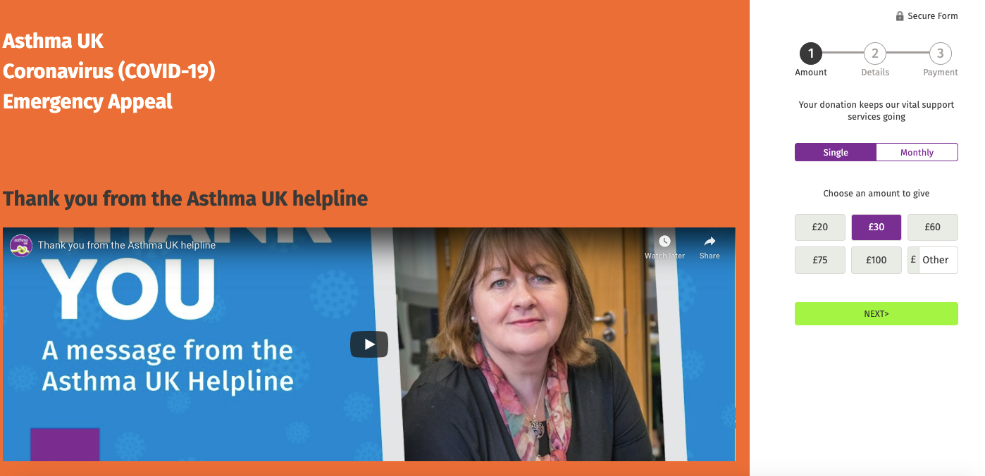
Asthma UK are providing stats about their helpline and their team’s vital support. They are also thanking their donors for their contributions that allow them to continue their work. This is a great way to show your support both to your team and your donors.
Make the process easy for your supporters
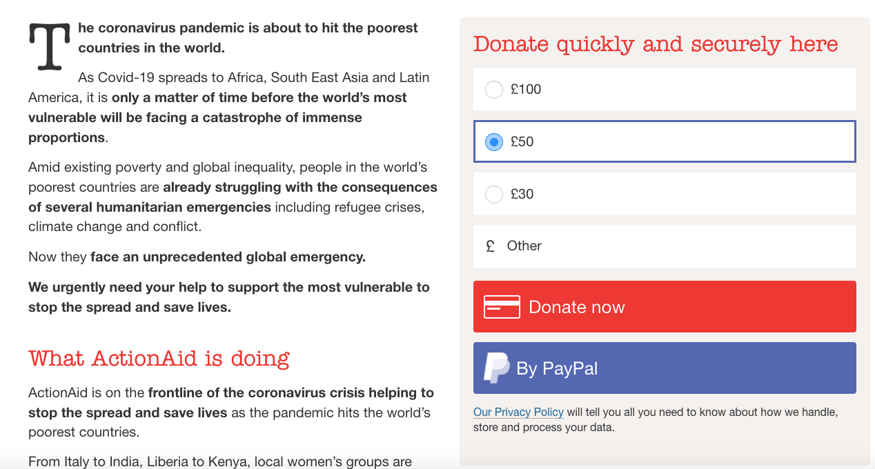
The copy in your landing page can make a difference. By mentioning “quickly and securely”, you are reassuring your supporters that they don’t need to spend too much time filling forms. When you are visiting Action Aid’s emergency appeal page, you can find all the information you want on the left while proceeding to the donation on the right of the page. The use of language promises for simplicity to help their supporters go through the donation as fast as possible.
Focus on the colours
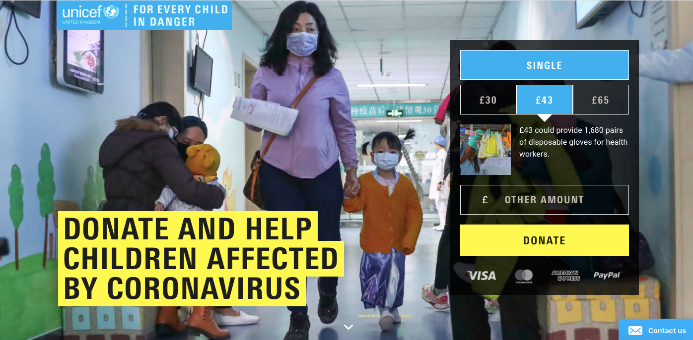
Even the use of colours can impact your total donations. As with every landing page, the conversion rate depends on many factors including the colours that you choose. UNICEF have decided to use yellow along with their usual blue to make a contrast that taps into the emergency. It’s a great idea to grab your attention when visiting the page.
Make your landing page mobile-friendly
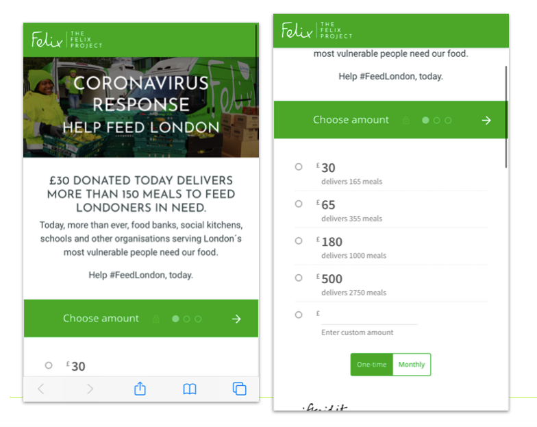
It’s important to test your landing page on different devices and browsers to ensure that it’s easy for everyone to donate. Here is an example of a mobile page from The Felix Project that makes the scrolling easy through a smartphone.
Explore new forms of fundraising
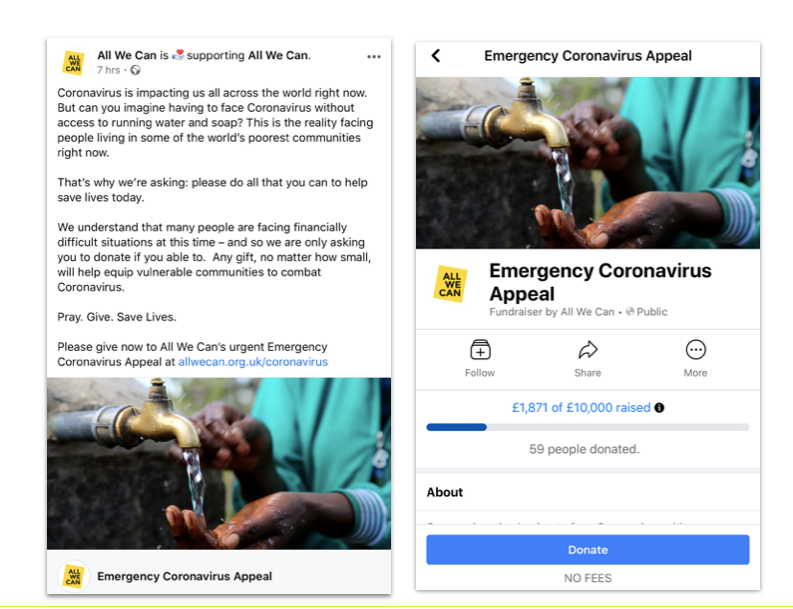
Having the option to fundraise directly through the most popular social media platform allows you to appeal to donors who might spend more time on social media than other traditional platforms. All We Can are promoting their appeal through their Facebook Fundraiser, which makes the donation process easier and faster.
Encourage alternative payment methods
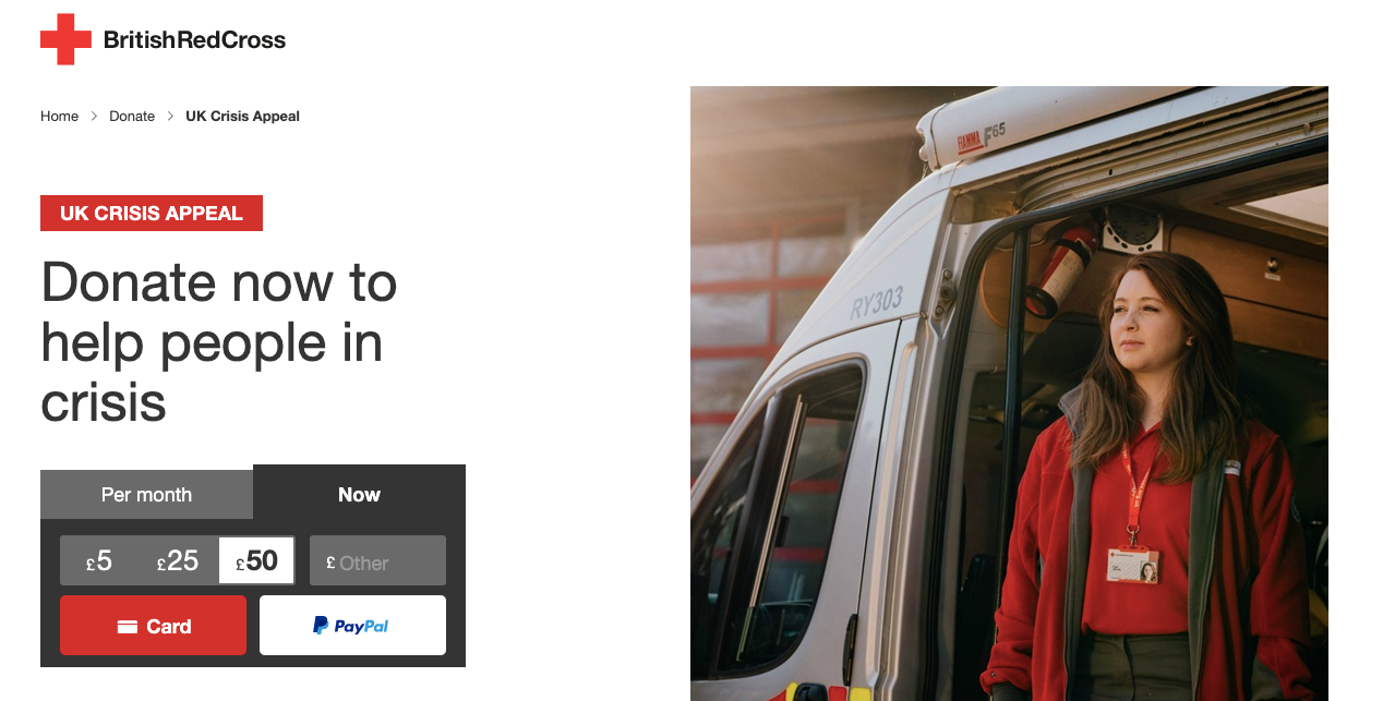
It’s good to highlight all the payment methods you are accepting to help your donors pick their preferred option. Adding Paypal along the card payment can help a number of donors who prefer this type of transaction.
Thank your donors
It’s important to thank your donors even before the end of your campaign. This is a great example from Become and their social media post thanking their donors. It’s a great way to express your gratitude while encouraging others to support your cause.
Interested in sharing your favourite examples from other coronavirus emergency appeals? Tweet us @lightful!
Latest articles
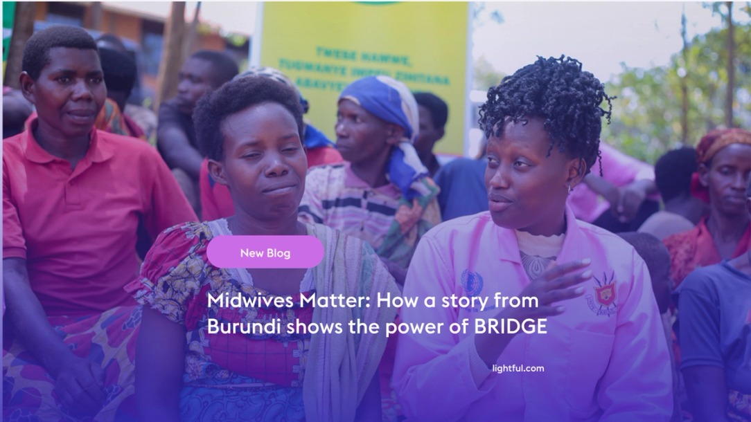
Over the past year, Lightful and the International Confederation of Midwives (ICM) have supported Midwives Associations across Africa, South Asia and the Eastern Mediterranean to build their digital confidence through our BRIDGE programme. These organisations were starting from very different places, but all shared the same goal: to use digital tools to strengthen their voice, raise their visibility and advocate for better outcomes for women and babies.
Related posts

One of the primary goals of Lightful's BRIDGE programme is to help small and grassroots nonprofits raise more funds through digital channels. Thanks to the tools and support we provide, participants' confidence in their digital skills grows dramatically. We also help them practice their new-found skills by running campaigns around key milestones, like Giving Tuesday, which provide real-world opportunities to test, learn and improve further.
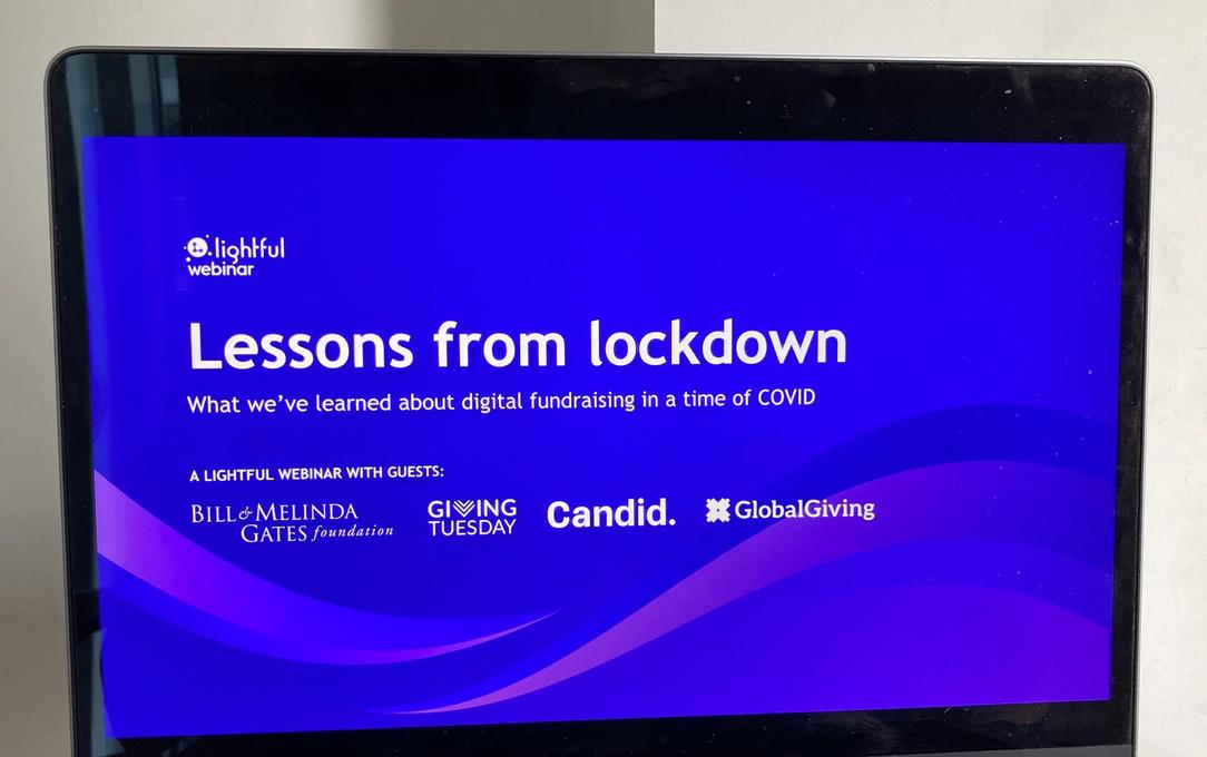
Last week we’ve hosted a webinar with a very interesting panel sharing their key lessons learned about digital fundraising during lockdown.
See who we help
Contact us
Want to learn more?
Email Jonathan and start a conversation


