15 tips to boost your online fundraising

One of the primary goals of Lightful's BRIDGE programme is to help small and grassroots nonprofits raise more funds through digital channels. Thanks to the tools and support we provide, participants' confidence in their digital skills grows dramatically. We also help them practice their new-found skills by running campaigns around key milestones, like Giving Tuesday, which provide real-world opportunities to test, learn and improve further.
Many of the organisations we work with have never run digital fundraising campaigns before, and the first task for many is to set up a way to receive donations online. That may sound like a very basic step, but without knowing what good looks like, there is a lot of room for error. Having worked for over 12 years at the UK's leading online fundraising website JustGiving, and run countless tests on pretty much every part of a donation process used by millions of people, I know very well what helps and hinders online donations and love talking about it (I'm a great guest at parties).
With this in mind, we wanted to support a BRIDGE cohort of organisations working in the areas of racial justice and gender equality to improve their digital fundraising. We did this by giving them money, and seeing how easy it was to do. So on Giving Tuesday 2021, we distributed $500 micro-grants in the form of online donations to over 150 US nonprofits, for a programme funded by the Bill and Melinda Gates Foundation, in partnership with Women's Funding Network and United Philanthropy Forum.
To understand more about the donor experience for each organisation, the Lightful Relationship Management team recorded the donation process of every single transaction. This, alongside a new email inbox that contains communications resulting from each gift, has provided a unique snapshot of online giving for small, grassroots US nonprofits - both in terms of the donation process itself, and the donor journey that starts after the gift.
Based on what we experienced, and our many years of digital fundraising experience, we have created our top 15 tips for great online donation experiences, as well as 5 pitfalls to avoid.
Top 15 Tips for a great donation process
In no particular order, here are our top 15 tips for digital fundraising success, which you can also download as a handy checklist.
1. Use prompts to contextualise donations
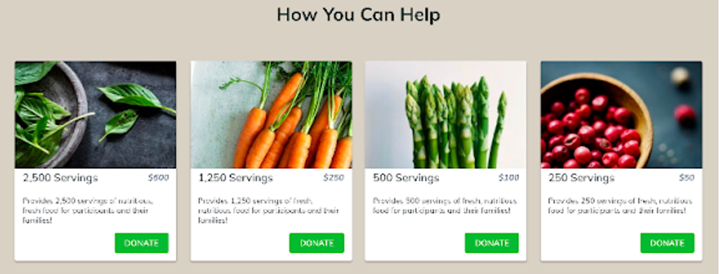
Offering a range of donation amounts, and explaining what they would pay for, gives donors a better understanding of how their gift will be used. This can also be a good technique to nudge people up to a higher gift.
This example from Wholesome Wave is great, in that it combines tangible amounts with enticing imagery. Also note how the amounts start high and decrease, anchoring the donor at a high amount - testing the order of donation prompts can also help increase average donation amounts.
2. Ensure donation forms are clear and accessible
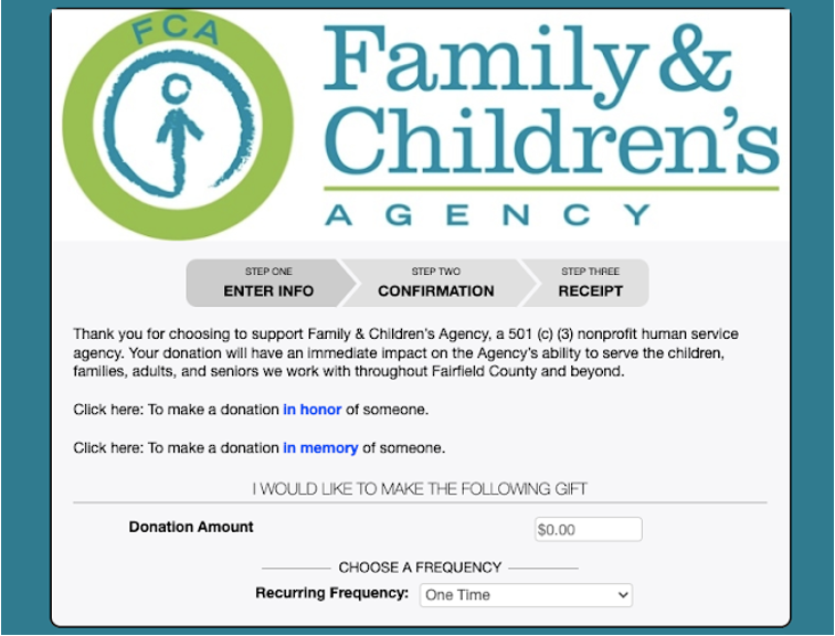
Check the colour contrast, and ensure screen readers can use your forms. Designing for accessibility of those with a range of needs ensures your design is more accessible for everyone. That could be as simple as providing progress indicators that explain what step in the process a donor is on, and how close they are to the end (which can help motivate completion).
The Family & Children's Agency does a good job of this by highlight the three stages of their process, right from the start.
3. Ensure the process is optimised for mobile devices
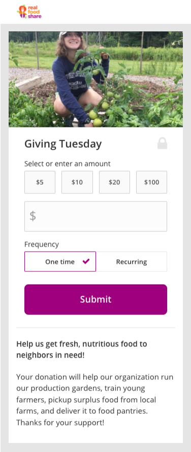
We were pleasantly surprised by the fact that the vast majority of sites were optimised for mobile. This is a very basic but vital thing to offer considering the amount of internet traffic that comes from mobile devices.
Real Food Share had a very clear, easy to understand mobile view.
4. Tell a consistent story from marketing to donations
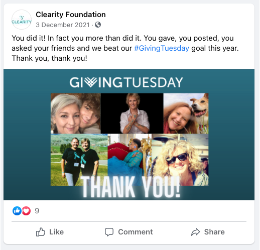
Whether you're sharing your donation ask in an email, a tweet or a Facebook post, the imagery and message needs to be consistent with what people see when they land on your donation page. A key part of BRIDGE is supporting organisations to tell their story more effectively across digital channels before, during and after a campaign, which the Clearity Foundation did brilliantly.
Their campaign messaging was strong and consistent, and shared across different channels including Facebook on the day of Giving Tuesday itself.
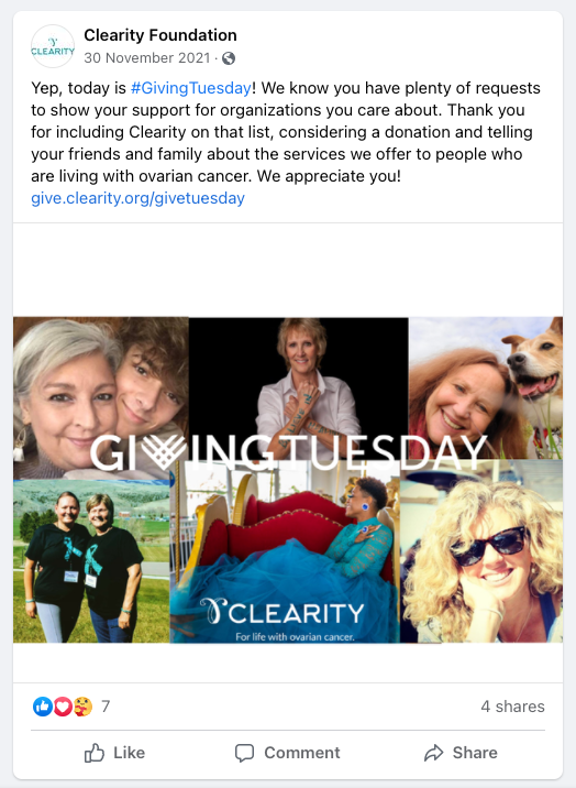
We saw lots of #GivingTuesday branded donation pages, but Clearity Foundation's had one of the strongest social media campaigns to back up its appeal and, crucially, tell a story from each social post that was carried on when a donor landed on their donation page.
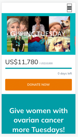
With such a well executed campaign from social to donation, it is perhaps not surprising that they hit their goal (and of course shared a big thank you to their supporters).
5. Ensure monthly/one-off differences are clear
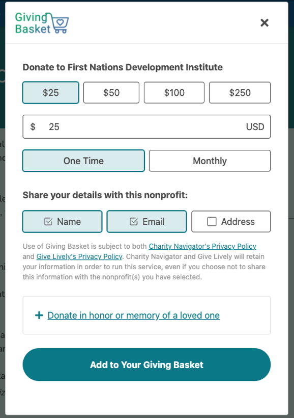
Offering a choice of regular or one-off gifts is a standard part of most online donation processes, but it is important to be very transparent about the difference, and avoid any nasty surprises that might mean donors abandon the process.
The donation form for the First Nations Development Institute makes the distinction very clear.
6. Send great thank you emails
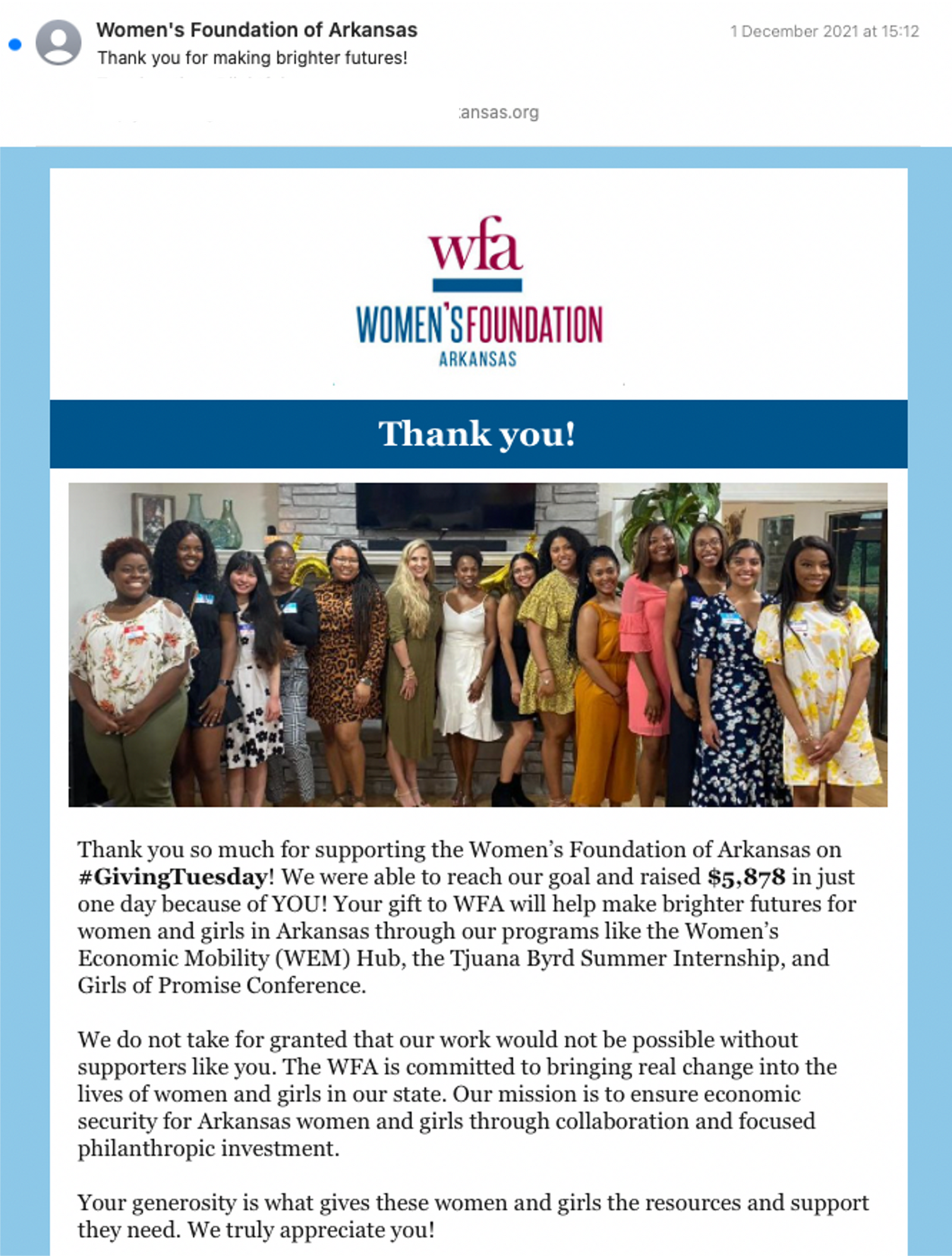
Timely, informative and inspiring emails are a crucial part of the start of your donor journey, which you hope will be the beginning of a long term relationship. Set up an automatic receipt that includes your social media handles and where donors can go to learn more about your work - and that first and foremost says "thank you".
The Women's Foundation of Arkansas was the best of a very good selection. It was timely, related to Giving Tuesday, and the language was all about "YOU" - the donor, and the impact you (not "we" the charity) had made.
7. Test your own process
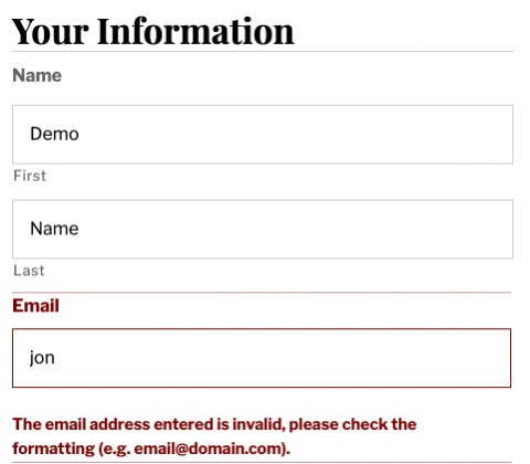
We encountered a number of errors that could have put off other donors, and they would have been easy to spot. The simplest way to test is to go through the process and enter the incorrect info in every field, and see if you can proceed. If there are any error messages, they should be informative and tell you the specific thing that needs updating, and be in context where that error needs to be fixed.
Here's a very simple example from the Cultural Alliance of Fairfield County, where a field is missing and the error message clearly shows where and what is missing.
In almost every case, making a donation to your own organization will prompt you to notice something that could be improved. Or even better, make a donation to someone else and see how their process compares to your own.
8. Encourage sharing of donations to social media
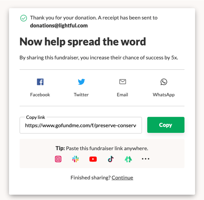
Donation social sharing is a topic I have been passionate about for over a decade, and have run countless tests on, because it is such a simple and effective way to encourage more donations. If you ask people to share that they've donated, you will reach an audience - their followers - who may not know who you are, and how may, in time, become supporters of your cause after this first interaction. It won't help raise millions more, but every dollar or pound counts.
This is something you typically get as standard with a good third party website, and GoFundMe have always been the leaders in using the power of social to generate extra funds, as demonstrated by the prompt after donating to the Stamford Historical Society.
9. Explain what tax-deductible donations means, and share receipts (in the US)
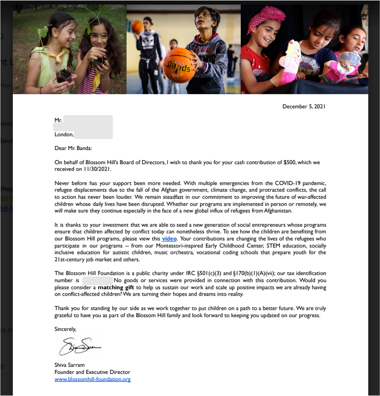
In the US, donations to registered nonprofits are tax-deductible, and this is particularly important to note for year-end giving campaigns, as many people give just before the end of the tax year. You probably don't want to link to the IRS' explanations, but it is important to be clear if donations to your organization are tax-deductible and that confirmation is sent via email for donors' tax records.
Blossom Hill do a fantastic job of including this fairly dry but important information in the context of a wonderful thank you letter. This was a pdf attachment to an email, and re-affirms the impact the donation has made, linking to a video to learn more and also includes a subtle nudge to see if the donation could be matched.
10. Integrate third party websites as much as possible
Receiving donations online is usually done with the help of specialist technology, and there are lots of services to choose from. In fact, even in this relatively small sample of organisations, we ended up using 30 different fundraising tools!
For the record, they were ActBlue, Acceptiva, Blackbaud, Charity Navigator, Chip-in, Chuffed, Classy, Collective, CommitChange, Convio, DonorBox, Donor Perfect, EveryAction, Formstack, Give Butter, Give Lively, Go Fund Me, Grapevine, Kindful, MobileCause, Neon One, Network for Good, Open, Patreon, PayPal (including direct. Pools, Fundraisers, PayPal Giving Fund), Realm, Salsa, SquareSpace, The Great Give, WeDidIt.
PayPal was the most popular provider, with more than 20% using PayPal - and using at least four different PayPal services too.
The important thing to note about using third-party platforms is that they should support a coherent journey from your nonprofit website, and ensure the storytelling is consistent. Many of the PayPal experiences were, naturally, transactional, but lost some of the joy of giving. The best third party experiences included stories, combined with excellent user experience you should expect from a tool that is constantly iterated and improved.
As all of the organisations in this cohort are doing incredible work around racial justice and gender equality, and sharing impactful and emotional stories, so the process should enhance not diminish the emotional pay-off of supporting this work.
The Women Encouraging Empowerment Giving Tuesday page was my personal favourite - powered by Givebutter - if mostly for the incredible sparkly donate button and great thank-you gifs!

11. Use great imagery and videos to tell a story
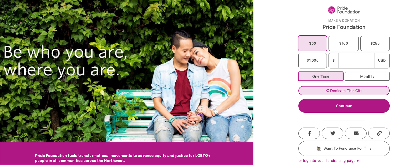
The phrase "a picture paints a thousand words" is something of a cliché, but it is also true that our brains process images quicker than text. So using an arresting, relevant and inspiring image is a great way to reinforce the message that a donor is on the way to doing something great by giving.
The Pride Foundation do a great job of using pictures of people (which are almost always the most effective images to use, with the possible exception of animals). The image includes a short and snappy headline, and the rainbow on the vest links to the rainbow symbol representing the LGBTQ+ community it supports. Those subtle but important touches all paint a picture for a prospective donor and signal they are in the right place, and about to do a good thing.
When it comes to video, Habitat for Humanity of Coastal Fairfield County tick all the best practice boxes. It's short, snappy, inspiring, uplifting, demonstrates impact, and brings supporters into the journey. Sit back, watch and enjoy.
12. Offer a range of donation methods
As we shared earlier, PayPal was the most popular donation tool used, but we saw a massive range of options on offer - and it is important to ensure you are enabling donors to give in the method they prefer. Particularly on mobile, offering options like Apple Pay or Google Pay, as well as PayPal, will streamline the process for your donors and maximise your conversion rate.
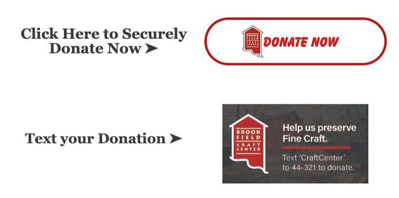
We like the way that the Brookfield craft center, for example, offers text donations as well as online donations.
Incidentally, one of the benefits of using third-party websites is that they will typically offer an ever increasing number of payment providers, so you don't have to do the hard work of integrating with each new option individually. And if they are good, the payment options should change depending on the context of the donor - for example, offering Apple Pay if browsing on an iPhone or Safari on Mac, or Android Pay if the donor is on an Android mobile device.
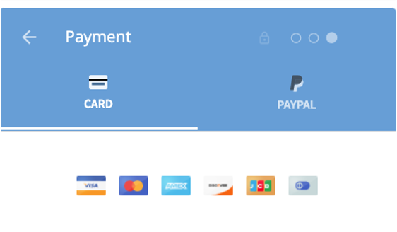
The Aurora Women and Girls Foundation use donorbox, and here you can see how they support a range of credit or debit cards, as well as PayPal, giving the donor choice.
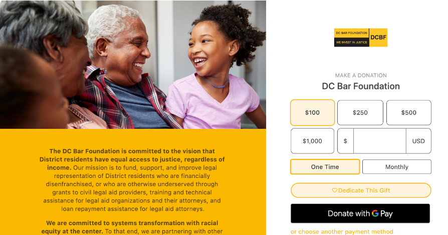
The DC Bar Foundation use the Give Lively platform, which offer a Donate with Google Pay option if you are browsing on an android device, but not if you aren't. These clever personalisation tips can really help boost conversion rates.
13. Encourage email sign ups
In a world of GDPR where data privacy is so important, you must ensure you have permission to regularly email your supporters. Asking someone to sign up to email after a donation is a great time to do so, as they have just taken a big first step in supporting you, and you need to build on that relationship and start a stewardship journey.
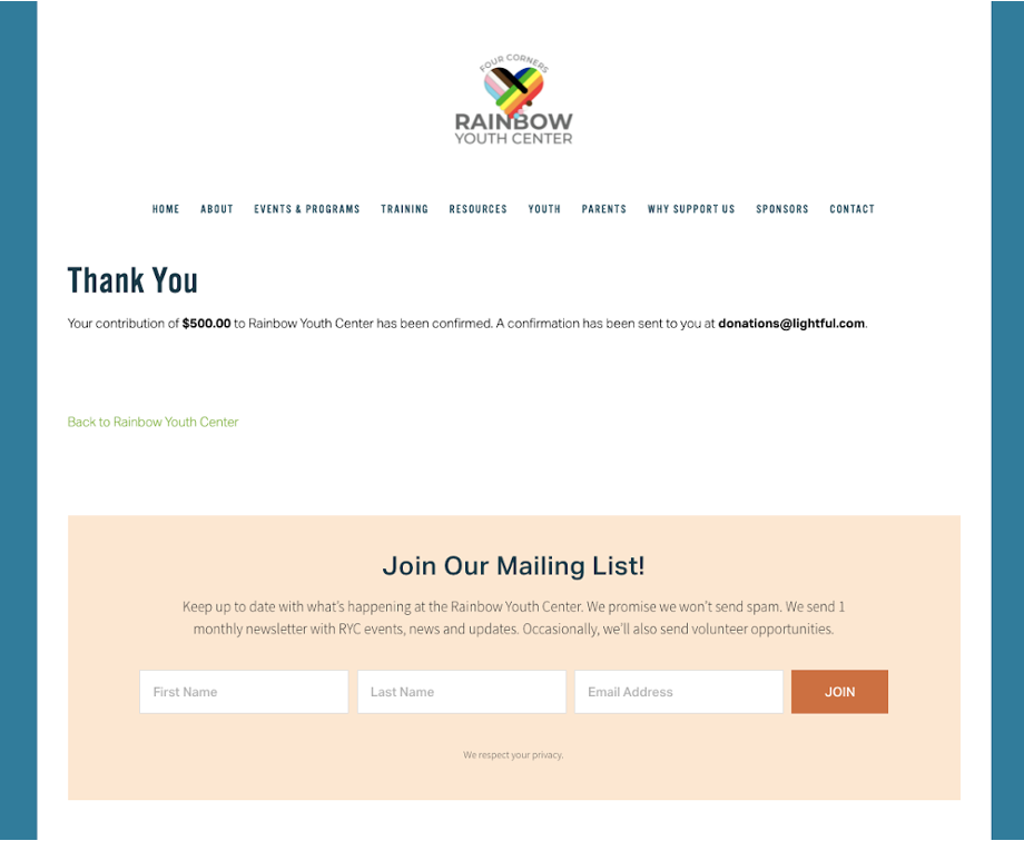
We appreciated how the Four Corners Rainbow Youth Center promote newsletter signups after a donation, and set the boundaries early - explaining how often emails are sent, and what they include - helping people make an informed choice about opting in.
14. Encourage employee matching (In the US)
Employee matching has not yet taken off in the UK, but there appeared to be quite a few different services that help donors find out if their employer will match donations in the US.
The Center for Family Justice use a service called Double the Donation to do this, asking donors to check immediately after completing the donation.
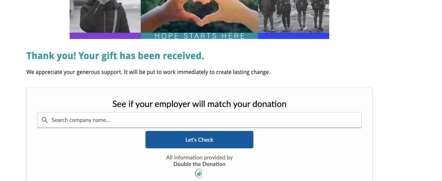
The best time to ask if matching is an option, is immediately after a donation has been made, because you may confuse or put off donors if they have to check before giving, which could impact their likelihood to complete the donation process. Which neatly leads us on to our last tip...
15. Less is more
An online donation process is, at a basic level, an e-commerce process with a start and finish and can be likened to a funnel. At the top of the funnel are all the visits to the start of a donation page, and at the bottom, are all the people who complete a donation. In between those steps, some people will always drop out. Your job as a digital fundraising practitioner, is to ensure that the number of drop-outs is as low as possible. The best way to do that, is to make the process easy, clear and have minimal distractions.
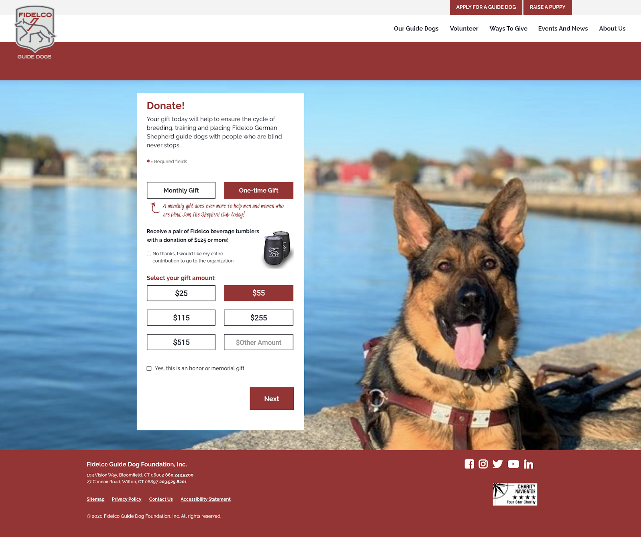
The Fidelco Guide Dog Foundation are a prime example of best practice. From landing on the page, the amount and frequency are pre-selected, so you can get to the next step in the process with just one click! The background is a lovely picture of a dog, that draws your eyes to the form, the navigation on the website is stripped back, and there is nothing else competing for your attention (except for your desire to help more dogs like the one in the picture).
Top 5 things to avoid
Here are some things you should really ensure are not part of your donation process. Each one of these things leads to fewer people completing a donation process, which means you will raise much less money. And we definitely don't want that to happen.
1. Long-winded and complex looking forms
Anything too complex, like one long page full of boxy-looking fields, is bound to put people off. Focus on accessibility and simplicity, and make it pleasing on the eye.
2. Asking for as much information as possible
Go through your form and ruthlessly ask yourself, do I really need that piece of information? Studies vary as to the specific impact, but every extra form field someone has to fill out potentially decreases your conversion rate.
3. Generic donation software - it needs to ‘feel’ good
Unlike regular e-commerce, when you donate online, you don't get the pay-off of buying something tangible after spending your money. A standard PayPal receipt is fine if I buy something from Ebay, and Ebay sends me more exciting emails about my purchase. But when donating, you don't get a thing in the post, so the experience cannot feel like a purchase, but must involve an emotional pay-off.
4. Convoluted Captcha or fraud rules
People want to give you money and support your cause, not select all the images that are buses. Now, preventing fraud is very important - and charity sites are often targeted by fraudsters trying to check stolen credit card details - so there need to be checks, but they should be proportionate and not so onerous that they get in the way of donating. Also, sometimes third-party websites might make a mistake and flag a transaction as fraudulent that may not be, so you should check what their process is if this ever happens.
5. Disconnected CRM
Unfortunately, some of the thank-you emails we received from organizations were very swiftly followed - even on the same day - by asks for more donations. That doesn't feel good, and is highly likely to have the opposite of the intended effect of raising more, and ensure people unsubscribe from your emails.
A great online donation process involves a great CRM process. Once a donation is made, the work to build a strong(er) relationship with that donor starts. The communications should be planned, strategic and with a long-term relationship in mind, not a quick fix to ask for more donations straight away.
Summary
The process of making all of these donations was fascinating, in that we expected it to be hard, but it was actually much harder and took much longer than we had planned. We saw a few things that would be best avoided, but also a wide variety of great examples of best practice which we're excited to share here.
Ultimately, there is no dearth of fundraising tools, but there is still a gap in understanding how to best use them, and how to use the data to build an effective customer journey.
We have helped hundreds of nonprofits around the world raise more funds through our BRIDGE programme, working on building digital skills and confidence to become more effective fundraisers. If you are a small nonprofit, ask the foundations who support you if they can provide you with tools to build your own digital capacity. And if you're a funder, get in touch with us and learn how you can support your own grantees.
In the meantime, be sure to follow our top tips, and start your own journey to digital fundraising success.
Latest articles
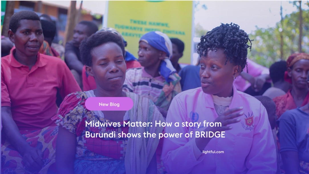
Over the past year, Lightful and the International Confederation of Midwives (ICM) have supported Midwives Associations across Africa, South Asia and the Eastern Mediterranean to build their digital confidence through our BRIDGE programme. These organisations were starting from very different places, but all shared the same goal: to use digital tools to strengthen their voice, raise their visibility and advocate for better outcomes for women and babies.
Related posts
Last week we’ve hosted a webinar with a very interesting panel sharing their key lessons learned about digital fundraising during lockdown.

Earlier this month we’ve hosted the first masterclass for our new BRIDGE cohort. Participating charities all over the world joined us to talk about digital fundraising in crisis and how to launch a successful campaign during COVID-19.
See who we help
Contact us
Want to learn more?
Email Jonathan and start a conversation


