A UX perspective: My first few months at Lightful

My name is Vikram and I’m a Canadian ex-pat living in the UK. I was hired by Lightful in late June 2019 as a Senior User Experience (UX) Designer. My reasons for wanting to join such a company are manyfold, but primarily stem from wanting to do something that makes a difference. When I say this, I really do mean ‘difference’ in terms of making life better for all, not for fulfilling a generic company vision!
And I found Lightful to be this company — one that seeks to truly enhance altruistic voices and #reclaimsocial. This isn’t just a side goal or a company vision stuck in a drawer somewhere, it is quite literally our product offering.
So…how can “UX” help do this?
User Experience is a relatively common term if you are in digital, but if you aren’t, it may not be. As an exciting, burgeoning field, User Experience slides here and there, fluidly encompassing ever more activities and areas. As such, it can, unfortunately, be used as a bit of a buzzword by some people.
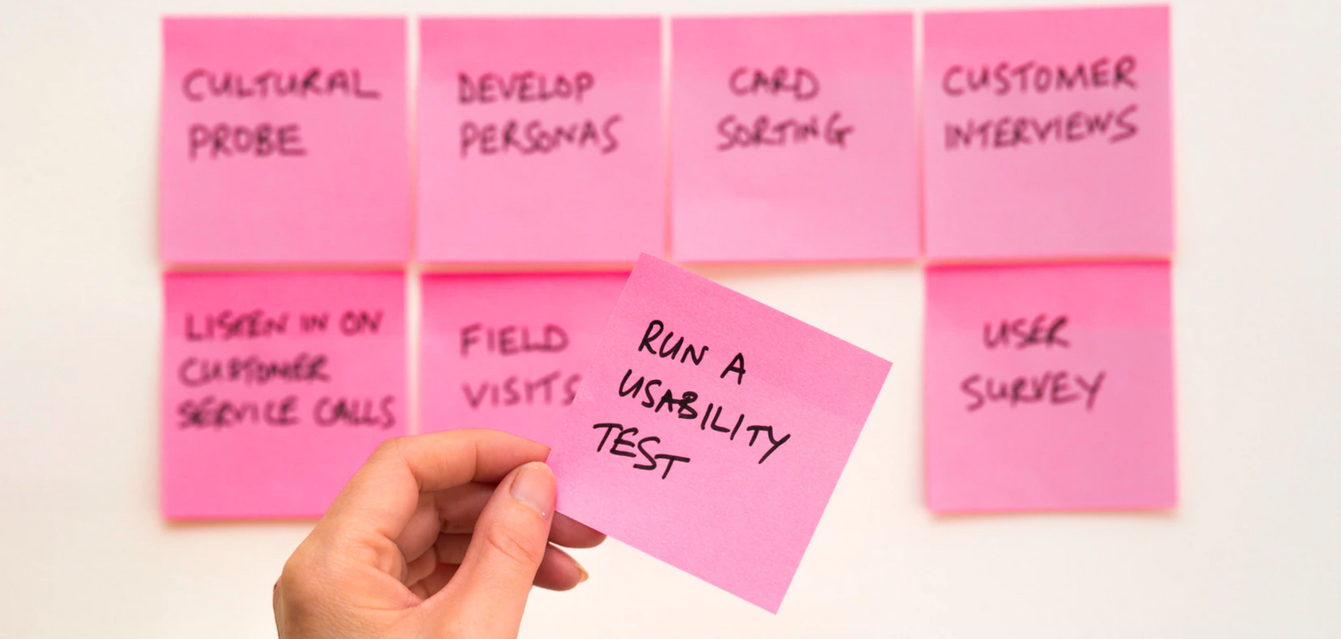
But there is a core to UX, one that is academically rigorous and has been developed over the latter part of the 20th century. UX comes from the belief that systems should be designed to respond to how humans actually behave in the world, not how we want humans to behave. A UXer works to research how users behave, what they need, and then works to design systems that accommodate these behaviours and needs.

In understanding our customers we aim to tweak old features of the Lightful platform to ensure that their usability and effectiveness are maximised, while also innovating new features that make social media posts and campaigns easier to do create, and more effective. We’ve already seen this happen; our tweaked social media post layouts are simpler to comprehend yet also more functional.
I’ve worked with our team to build a “Discovery” process that involves rigorous research, prototyping, and evaluation of prototypes. This provides insight into new changes or features we can take into development and allows us to deeply understand what needs we are addressing and to what extent.
But UX isn’t only applicable to digital product development. It can be applied to almost anything – take my onboarding here at Lightful. Thoroughly done, it involved key UX principles.
Onboarding the right way
There’s no question that anyone’s first few weeks in a new job are busy, and this is doubly true for a startup. Yet Lightful pioneered a robust new onboarding process that managed to soften a good deal of the bumps one encounters when joining a new company. My first 3 months have been full, but intelligently structured.
There’s a term that we use in UX called “Zone of Proximal Development”. This means timing experiences just right to get users to learn things that are just ahead of what you expect them to already know. Too advanced, they will be confused. Too simple and they will be annoyed. Too much, and they’ll be overwhelmed. As I see it, my onboarding at Lightful followed this approach.
Prior to joining I was invited to spend a day hanging out with the team – this actually proved really useful as it was a non-stressful way to get to know people, have some time to consider how I best fit with the team, and where I might want to take UX activities. I learned basic things about the company without needing to worry about deep diving.
I was given a work buddy too — Priscilla (she’ll often be your buddy too if you use our platform’s chat function!). She showed me around the organisation and ensured that I had everything I needed. There are times where you may need help at a level that only someone who has been through a similar process understands. Work buddies understand the (sometimes silly!) questions you may need to ask – they know what you may find confusing!
Bamboo HR was also used, which is an online Human Resources tool. This provided me with a checklist of key people to speak to about the different areas of our company, and key documents to look over. Formalising it in this way made my understanding a key activity – not an optional one for when everyone has time – that slowly ramped up my overtime. From a UX perspective, this might be considered helping me construct a ‘mental model’ of the company, its activities and personnel.
Where next?
I’ve been loving my time at Lightful and am honestly excited about some of the innovative features we have in the pipeline. We’re going to be testing some of these features and new prototypes, so if you’re involved in 3rd sector social media activities and interested in feeding back on our features, please contact me by clicking here! We’d love to have you involved!
Latest articles

Over the past year, Lightful and the International Confederation of Midwives (ICM) have supported Midwives Associations across Africa, South Asia and the Eastern Mediterranean to build their digital confidence through our BRIDGE programme. These organisations were starting from very different places, but all shared the same goal: to use digital tools to strengthen their voice, raise their visibility and advocate for better outcomes for women and babies.
Related posts

How familiar are you with sustainable web design? Here are Lightful, we are currently working on a redesign of our website so we wanted to find out more about sustainable design and what this means for us.

Guest post by Felicity Hamilton – Junior Designer at Social Misfits Media
See who we help
Contact us
Want to learn more?
Email Jonathan and start a conversation


